Chromatic Aberration vs Blood/Dirt: Which is worse
The Great Graphical Debate: Which Visual Effects Deserve a Spot in Your Game?
When we talk about modern video games, the pursuit of realism often leads us down a fascinating, sometimes agonizing, path. Among the myriad visual details that define the immersive experience, there is a persistent, fiery debate about which graphical effects are essential enhancements and which are merely visual clutter. Are effects like motion blur and bloom legitimate artistic tools, or are they the spawn of some demonic computer graphics division?
It is time to settle the score. We are throwing down the gauntlet for a final reckoning on these visually intense elements. Instead of letting the discussion devolve into endless arguments about whether effects like chromatic aberration or film grain are merely flaws, we propose a structured, knockout format to determine which effects truly deserve a place in a game’s settings menu.
The proposed format pits two effects head-to-head in competitive rounds, with only one victor advancing. This structure ensures that the most passionately debated visual features are put directly against each other, forcing a clear verdict from the gaming community.
The initial head-to-head matchups include:
Motion blur versus lens flare.
Depth of field versus vignette.
Chromatic aberration versus dirt.
Film grain versus bloom.
These pairings push the boundaries of what we consider “realism” and allow players to weigh the functional benefits against the aesthetic drawbacks of each visual choice.
The results of this contest, and the arguments that follow, will undoubtedly spark lively debates. Some will argue that motion blur serves a crucial purpose in conveying speed, while others will insist that it is an unnecessary distraction.
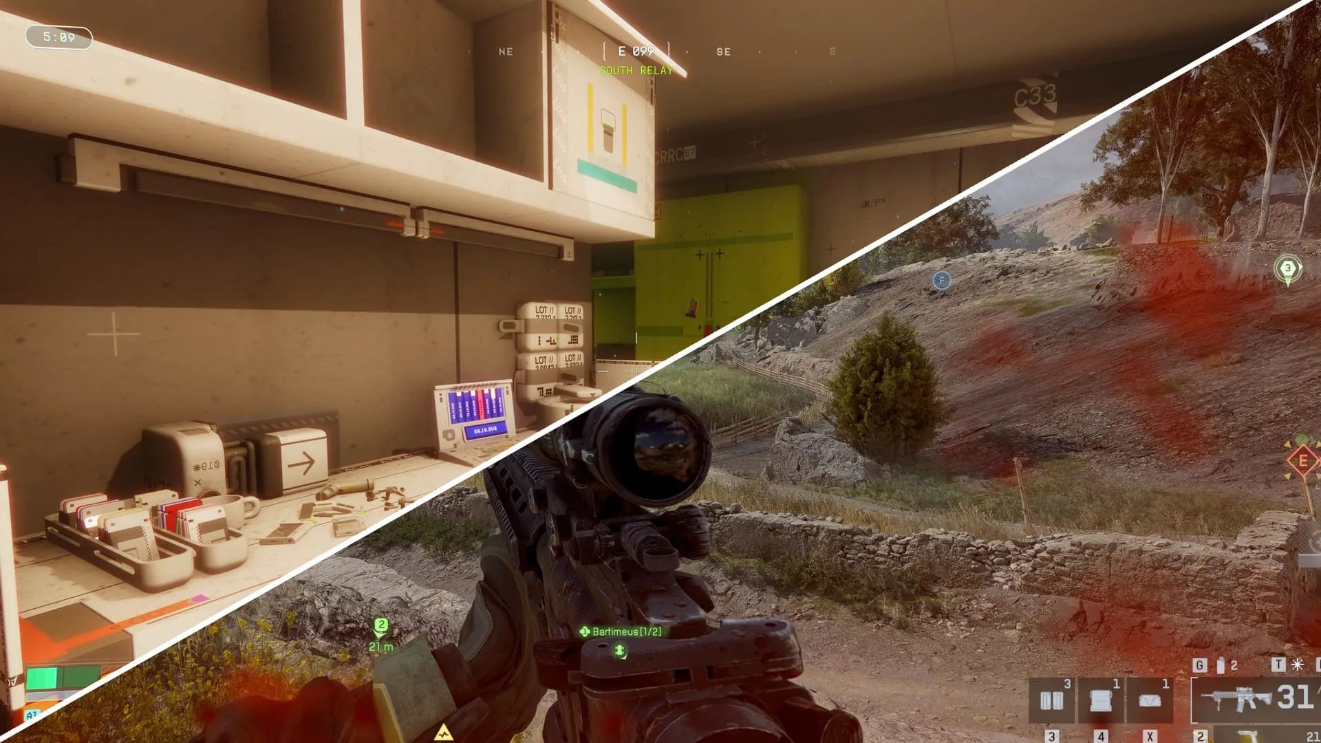
To give context to the possibilities, consider the specific examples of these phenomena in action. Chromatic aberration, for instance, is a signature effect that Bungie has integrated into titles like Marathon, creating that distinct red/blue border effect on elements like the white cabinet.
Similarly, the question of realistic damage also enters the discussion. In titles like Battlefield 6, the simulated Blood/dirt effect raises an interesting question: should such visual indicators be accepted as a valid health or damage display?
This visual balancing act highlights a deeper truth about game design—that the definition of quality often rests on subjective choice. Whether a shimmering bloom or a subtle film grain is acceptable depends entirely on the player’s preference, turning the settings menu into a philosophical battleground for every visual enthusiast.
Buy on Amazon
Credit