Microsoft admits new Outlook looks awful
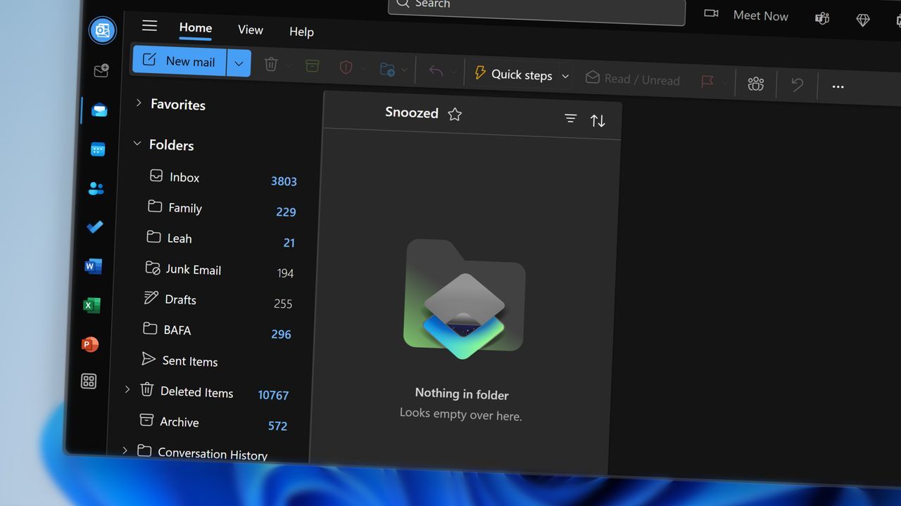
The rollout of Microsoft’s new Outlook has sparked a predictable reaction: frustration. Many users are finding themselves wrestling with an interface that, while functional, feels strikingly different from the classic experience they grew up with. This simmering dissatisfaction has led to a curious maneuver from Microsoft, attempting to soothe the transition for those who miss the familiar layout.
In an effort to bridge the gap between the classic and the modern, Microsoft is introducing an optional setting within Outlook on the web and the new Outlook for Windows. This feature is designed to allow users to adjust their experience to more closely resemble the classic Outlook for Windows environment.
How exactly does this adjustment work? Microsoft details the option in a recent message, explaining that enabling the setting coordinates changes across the entire experience. This means the adjustment extends beyond mere aesthetics; it modifies visual styling, layout, typography, icons, and selected interactions.
The objective is clear: to provide a more comfortable entry point for users transitioning away from classic Outlook. As part of a phased rollout, the classic theme will be enabled for specific users moving from the older application.
However, the very need for such a deep customization speaks volumes about the initial friction. Critics argue that the new Outlook is more of a web wrapper than a true native application, and while it may offer new capabilities, it often performs less smoothly than its predecessor.
The resistance to the change is palpable. Frustration has been voiced across the digital community, with users asking pointed questions about the direction of the software. This indicates that for many power users, the change represents more than just a visual update—it’s a fundamental shift in workflow.
The ongoing debate highlights a fundamental tension in software design: balancing innovation with familiarity. Microsoft’s latest update is an attempt to navigate this tension, offering a compromise that acknowledges the enduring appeal of the classic design while pushing forward with new features.
Ultimately, whether this feature successfully alleviates the discontent remains to be seen. For now, it serves as a fascinating demonstration of how even subtle interface tweaks can reveal the deep-seated preference users have for the familiar framework.
Buy on Amazon
Credit
