
Windows 11 UI Modern Redesigns coming next
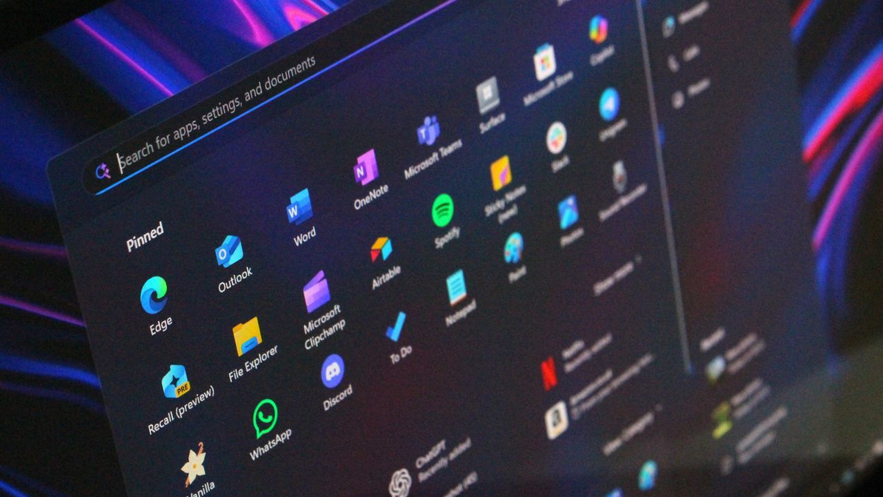
The Great UI Revolution: How Windows is Finally Finding Its Polish
For years, the Windows operating system has wrestled with an identity crisis. What started subtly with Windows 8, this long-standing platform accumulated inconsistencies across its user interface—from iconography and context menus to overall framework design. This lack of cohesion eventually led many users to perceive Windows as lacking the polish and craftsmanship found in competitors like macOS, contributing to a lingering feeling that the system was never truly finished.
The turning point came with the launch of Windows 11 in 2021. Microsoft recognized that a fundamental overhaul of the user experience was necessary. The introduction of the WinUI framework marked a bold commitment to solving this historical problem by establishing a consistent design language across the operating system. This effort wasn’t just about aesthetics; it was about building a more cohesive, unified digital environment for users.
Slowly but surely, this modernization effort has taken hold. Microsoft is systematically updating older, disparate UI surfaces with contemporary alternatives that align with the Windows 11 aesthetic. Details of this transformation are visible everywhere, from controls to core application elements, demonstrating a deep dive into fixing long-standing design flaws.
One immediate victory has been improving visual consistency. Features like dark mode have received significant upgrades across the interface, ensuring better parity in areas like File Explorer, where support was previously lacking. This focus on unified visual settings makes the entire experience feel more deliberate and finished.
The work extends into the deep structural components of Windows. Microsoft is actively rewriting some of the oldest parts of the OS using WinUI. This includes tackling legacy features that have dated the experience for years:
The File Properties dialog in File Explorer, an area untouched for over a decade, is being rebuilt with WinUI. This means users will soon experience a consistent design for managing file properties across the board. Similarly, interface elements like the Autoplay Menu and Print Management are receiving modern updates, bringing them into line with current standards and supporting features like dark mode.
Even familiar tools are getting a makeover. The long-standing Run dialog is being overhauled with WinUI, promising a faster, more functional experience. This new iteration will also introduce helpful features, such as the ability to quickly access home directories and view application icons in the recent search list.
Furthermore, context menus—the menus that pop up when you right-click—are undergoing a major redesign. Microsoft is implementing a new compact design that prioritizes speed and responsiveness. This update will make context menus lighter and faster, and it will empower users with greater control, allowing them to customize which actions appear in the menu.
The entire system is being re-engineered for performance. By moving more elements under a single UI framework, Microsoft is working toward creating a unified System Compositor designed to manage all WinUI interfaces efficiently. The goal is clear: reduce memory usage and boost overall speed, making Windows feel less bloated and significantly faster.
This ongoing commitment highlights a renewed focus on design craft within the company. As internal leaders continue to refine their tools for updating legacy code, it signals Microsoft’s dedication to evolving the platform. By focusing on polish and consistency, Windows is moving toward an experience that feels genuinely cared for—a unified, powerful, and cohesive operating system for the future.
Buy on Amazon
Credit